Comms Cucina Branding

At Mia Creative, we understand that a brand's essence is communicated through its visual identity. Our recent collaboration with Comms Cucina, a forward-thinking PR firm, stands as a vibrant manifestation of this belief. Here, we invite you to explore the brand guidelines meticulously crafted to narrate Comms Cucina's story, one that’s as dynamic and engaging as the services they offer.
https://www.pinterest.nz/miacre - ative_/comms-photography
Imagery and Illustrations:
The brand assets for Comms Cucina incorporate illustrations that hark back to the timeless charm of retro Europe, providing a unique and lively visual narrative. This illustrative style is not only attention-grabbing but also evokes a sense of nostalgia, perfectly suiting a PR firm that values both the old and the new.
Photography Style: Elegant Simplicity
In line with the brand’s essence, the photography style of Comms Cucina exudes elegant simplicity. Utilizing natural light and capturing serene landscapes, the imagery reflects the firm's penchant for creating narratives that are both sensuous and straightforward, with a playful European twist.
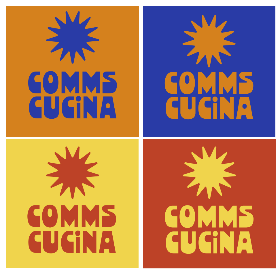
Icons & Illustrations: Symbols of a Radiant Vision
The icons developed for Comms Cucina capture the warmth and energy of a radiant European summer, translating the firm's optimistic outlook into visual form. These icons are more than mere decoration; they are integral to the brand’s story of clarity and the promise of new beginnings.


The Essence of Comms Cuc
A brand’s attention to detail can be seen in the smallest things, like business cards and signs. Buoy Cafe & Eatery’s bold red and crisp white branding elements crafted by Mia Creative, echo the vibrancy and clarity of maritime visuals. These are not mere informational pieces but are integral parts of a greater story—a story of coastal culinary adventures and memorable moments.
A Palette that Speaks Volumes
The colour palette chosen for Comms Cucina's branding is anything but ordinary. With a mix of golden yellow, vibrant orange, deep blue, and fiery red, the palette is a bold statement of Comms Cucina's energetic and multifaceted approach to public relations. This choice of colors aims to infuse a sense of excitement and engagement in all their communications.
Typography is a crucial element of any branding strategy. For Comms Cucina, Mia Creative selected fonts that balance a modern and impactful header font with a warm and friendly body text. This combination aligns perfectly with the firm’s approachable yet professional image

